💻/CSS
(45) [CSS] 3일 레이아웃과 포지셔닝 - Grid
따궈
2024. 4. 18. 13:46
Grid Layout이란?
페이지를 여러 주요 영역으로 나누거나, 크기와 위치 및 문서 계층 구조의 관점에서
HTML 기본 요소로 작성된 콘트롤 간의 관계를 정의하는데 탁월하다.
테이블과 마찬가지로 그리드 레이아웃은 세로 열과 가로 행을 기준으로 요소를 정렬할 수 있다.

Grid 구성
Grid는 복수의 자식 요소인 Grid Item과 그 상위 부모 요소인 Grid Container(그리드 컨테이너)로 구성된다. 정렬하려는 ㄴ요소의 부모 요소에 'display:grid' 또는 'display:line-grid'속성을 선언한다.

Grid Container 속성
| 속성 | 의미 |
| display | 그리드 컨테이너를 정의 |
| grid-tmplate-rows | 명시적 행의 크기를 정의 |
| grid-tmplate-columns | 명시적 열의 크기를 정의 |
| grid-template-areas | 영역 이름을 참조해 템플릿 생성 |
| row-gap | 행과 행 사이의 간격을 정의 |
| colum-gap | 열과 열 사이의 간격을 정의 |
| grid-auto-rows | 암시적인 행의 크기를 정의 |
| grid-auto-columns | 암시적인 열의 크기를 정의 |
<!DOCTYPE html>
<html>
<head>
<meta charset="UTF-8">
<title>Insert title here</title>
<style type="text/css">
* { box-sizing: border-box; }

.container {
  width: 600px;
  height: 600px;
  margin: 50px;
  background-color: #fff;
  border: 10px solid #eee;
  border-radius:10px;

  display: grid;

  grid-template-rows: 100px auto 100px;
  grid-template-columns: 100px auto;
}

.item {
   font-weight: 900;
   font-size: 25px;
   border: 1px solid #333;
   border-radius: 3px;

   display: flex;
   align-items: center;
   justify-content: center;
}

.item1 { background : rgb(255, 100, 70); }
.item2 { background : rgb(255, 165, 0); }
.item3 { background : rgb(50, 205, 50); }
.item4 { background : rgb(255, 105, 180); }
.item5 { background : rgb(30, 145, 255); }
.item6 { background : rgb(170, 170, 170); }

</style>

</head>
<body>

<h3>Grid Layout</h3>
<p>
   grid-template-rows/grid-template-columns : 명시적 행/열(Track)의 크기를 정의
</p>

<div class="container">
  <div class="item item1">1</div>
  <div class="item item2">2</div>
  <div class="item item3">3</div>
  <div class="item item4">4</div>
  <div class="item item5">5</div>
  <div class="item item6">6</div>
</div>

</body>
</html>

<!DOCTYPE html>
<html>
<head>
<meta charset="UTF-8">
<title>Insert title here</title>
<style type="text/css">
* { box-sizing: border-box; }

.container {
  width: 600px;
  height: 600px;
  margin: 50px;
  background-color: #fff;
  border: 10px solid #eee;
  border-radius:10px;

  font-weight: 900;
  font-size: 25px;

  display: grid;

  grid-template-rows: 100px auto 100px;
  grid-template-columns: 100px auto;
  grid-template-areas:
  	"header header"
  	"nav body"
  	"footer footer"
}

.header {
  grid-area: header;
  border: 1px solid #3bc9db;
  background: #99e9f2;
  margin: 5px 5px;

  display: flex;
  justify-content: center;
  align-items: center;
}

.nav {
  grid-area: nav;
  border: 1px solid #3bc9db;
  background: #99e9f2;
  margin: 5px 5px;

  display: flex;
  justify-content: center;
  align-items: center;
}

.body {
  grid-area: body;
  border: 1px solid #3bc9db;
  background: #99e9f2;
  margin: 5px 5px;

  display: flex;
  justify-content: center;
  align-items: center;
}

.footer {
  grid-area: footer;
  border: 1px solid #3bc9db;
  background: #99e9f2;
  margin: 5px 5px;

  display: flex;
  justify-content: center;
  align-items: center;
}
</style>

</head>
<body>

<h3>Grid Layout</h3>
<p>
   grid-template-areas - 영역(Area) 이름을 참조해 템플릿 생성
</p>

<div class="container">
  <header class="header">HEADER</header>
  <nav class="nav">NAV</nav>
  <article class="body">BODY</article>
  <footer class="footer">FOOTER</footer>
</div>

</body>
</html>

<!DOCTYPE html>
<html>
<head>
<meta charset="UTF-8">
<title>Insert title here</title>
<style type="text/css">
* { box-sizing: border-box; }

.container {
  width: 600px;
  height: 600px;
  margin: 50px;
  background-color: #fff;
  border: 10px solid #eee;
  border-radius:10px;

  display: grid;
  grid-template: repeat(3, auto) / repeat(2, auto);
  gap: 10px;
}

.item {
   font-weight: 900;
   font-size: 25px;
   border: 1px solid #333;
   border-radius: 3px;
   padding: 10px;

   display: flex;
   align-items: center;
   justify-content: center;
}

.item1 { background : rgb(255, 100, 70); }
.item2 { background : rgb(255, 165, 0); }
.item3 { background : rgb(50, 205, 50); }
.item4 { background : rgb(255, 105, 180); }
.item5 { background : rgb(30, 145, 255); }
.item6 { background : rgb(170, 170, 170); }

</style>

</head>
<body>

<h3>Grid Layout</h3>
<p>
  grid-template : grid-template-rows, grid-template-columns, grid-template-areas의 단축 속성<br>
  gap : 그리드 라인(행/열) 사이 간격(Gutter)을 조정
</p>

<div class="container">
  <div class="item item1">1</div>
  <div class="item item2">2</div>
  <div class="item item3">3</div>
  <div class="item item4">4</div>
  <div class="item item5">5</div>
  <div class="item item6">6</div>
</div>

</body>
</html>
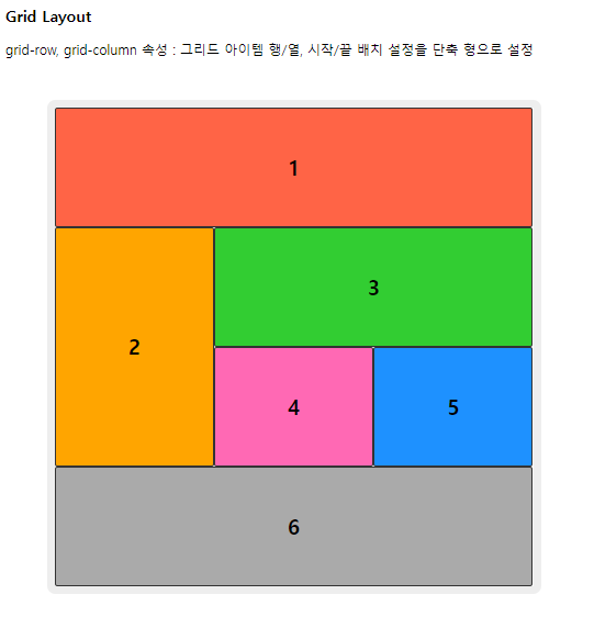
Grid Items 속성
| 속성 | 의미 |
| grid-row-start | 그리드 아이템의 행 시작 위치 지정 |
| grid-row-end | 그리드 아이템의 행 끝 위치 지정 |
| grid-column-start | 그리드 아이템의 열 시작 위치 지정 |
| grid-column-end | 그리드 아이템의 열 끝 위치 지정 |
<!DOCTYPE html>
<html>
<head>
<meta charset="UTF-8">
<title>Insert title here</title>
<style type="text/css">
* { box-sizing: border-box; }

.container {
  width: 600px;
  height: 600px;
  margin: 50px;
  box-sizing: border-box;
  background-color: #fff;
  border: 10px solid #eee;
  border-radius:10px;

  display: grid;
  grid-template-rows: repeat(4, 1fr);
  grid-template-columns: repeat(3, 1fr);
}

.item {
   font-weight: 900;
   font-size: 25px;
   border: 1px solid #333;
   border-radius: 3px;
   padding: 10px;
   box-sizing: border-box;

   display: flex;
   align-items: center;
   justify-content: center;
}

.item1 { grid-column: 1 / 4; } /* 3칸 */
.item2 { grid-row: 2 / 4; } /* 2행 */
.item3 { grid-column: 2 / span 2; } /* 2열부터 2칸 */
.item6 { grid-column: 1 / span 3; } /* 1열부터 3칸 */

.item1 { background : rgb(255, 100, 70); }
.item2 { background : rgb(255, 165, 0); }
.item3 { background : rgb(50, 205, 50); }
.item4 { background : rgb(255, 105, 180); }
.item5 { background : rgb(30, 145, 255); }
.item6 { background : rgb(170, 170, 170); }

</style>

</head>
<body>

<h3>Grid Layout</h3>
<p>
    grid-row, grid-column 속성 : 그리드 아이템 행/열, 시작/끝 배치 설정을 단축 형으로 설정 <br>
</p>

<div class="container">
  <div class="item item1">1</div>
  <div class="item item2">2</div>
  <div class="item item3">3</div>
  <div class="item item4">4</div>
  <div class="item item5">5</div>
  <div class="item item6">6</div>
</div>

</body>
</html>
<!DOCTYPE html>
<html>
<head>
<meta charset="UTF-8">
<title>Insert title here</title>
<style type="text/css">
* { box-sizing: border-box; }

.container {
  width: 800px;
  margin: 50px;
  padding: 20px;
  background-color: #e3fafc;
  border: 1px solid #99e9f2;

  display: grid;
  grid-gap: 40px;
  grid-template-columns: repeat(auto-fill, minmax(160px, 1fr));
  grid-auto-rows: minmax(100px, auto);
  grid-auto-flow: dense; /* 크기가 작은것은 남는 공간에 배치 */
  	/* 주석 처리하면 6의 위치가 바뀜 */
}

.container > .item {
  border: 1px solid #3bc9db;
  border-radius: 3px;
  background-color: #99e9f2;
  font-size:250%;
  color: #fff;

  display: flex;
  align-items: center;
  justify-content: center;
}

.item:nth-child(1) { grid-row-end: span 2; }
.item:nth-child(2) { grid-row-end: span 3; }
.item:nth-child(4) { grid-row-end: span 3; }
.item:nth-child(5) { grid-column-end: span 2; }
</style>

</head>
<body>

<h3>Grid Layout</h3>

<div class="container">
  <div class="item">1</div>
  <div class="item">2</div>
  <div class="item">3</div>
  <div class="item">4</div>
  <div class="item">5</div>
  <div class="item">6</div>
</div>

</body>
</html>
